Ep. 152: Clever Extra - Chromatic Consciousness
In this special episode, we are shining some light on color. Brought to you by Ultrafabrics, this presentation was recorded in May 2021 as part of CLOSEUP, a live & virtual 2-day design showcase event presented by WantedDesign Manhattan and ICFF.
We dive into color - its power to influence our perception, our mood, even our consciousness with several experts. We hear from Kimberle Frost, a color specialist for Ultrafabrics; Larah Moravek, founder and design director of Dutch East Design; Malene Barnett, artist and founder of the Black Designers + Artists Guild; Anna Murray, designer and co-founder of Patternity; and Patrick O’Donnell, international brand ambassador for Farrow & Ball.
The conversation touches on how the pandemic has influenced our appetite for color, how to be more creative with color and how we can break some of the “rules” around color and explore new inspiring ways to bring color into our everyday life.
Special thanks to Ultrafabrics for supporting this episode. Learn more at ultrafabricsinc.com.
Read the episode transcript here.
Malene Barnett: I really am interested in how people even interact with the pieces and what kind of memory did that color bring up. I think those memories are what's important for us, and how we share that.
Amy Devers: Hi everyone, I’m Amy Devers and this is Clever. For this special presentation titled Chromatic Consciousness we are taking on the subject of Color and it’s power to help influence our perception, our mood, even our consciousness. Here to break this down are several experts who are known for designing with color in impactful ways... Kimberle Frost, a color specialist with Ultrafabrics, Larah Moravek, Founder and Design Director of Dutch East Design, Malene Barnett, artist, entrepreneur, and founder of the Black Artists + Designers Guild, Anna Murray, designer of patterned-based art initiatives and co-founder of Patternity, and Patrick O’Donnell, international brand ambassador for British Paint and Paper company, Farrow & Ball. This conversation is brought to you by Ultrafabrics, and was recorded in May 2021 as part of CLOSEUP, a Live & Virtual 2 day design showcase event presented by WantedDesign Manhattan and ICFF. Now Here’s Chromatic Consciousness.
I'm delighted to start this conversation about Chromatic Consciousness.
Color is important. We just saw that video which was a sexy explosion of color among other things, but color holds the power to influence our perception, to communicate to our subconscious, and impact our moods, focus, sense of safety, comfort, and even joy. It has the power to carry messages of culture, history, and identity.
If we define consciousness as being awake and aware to one's surroundings, then chromatic consciousness suggests a conscious intention by the designer to work with color in ways that support our needs and harmonize with our growth as humans. In these times where issues of wellness, justice, and connection are paramount. We're looking at color and how we can consciously harness its power to communicate, connect, and hold space, and even enliven, uplift, and transcend.
Let's start with the communication piece. How are you using color to communicate, connect, and hold space? If color is the language, what is the message and how is it delivered? Is there a particular piece of work or a project that you did where color played a role in making an impact and relaying the intended message? Let's start with Anna. Your work with patterns is a conscious means of making sense of complexity. What do you have to say about using color to communicate?
Anna: Well for me, at Patternity, a lot of what we explore traditionally has been very much monochromatic. A project that probably brings that to life best is we designed a huge, gigantic, immersive labyrinth installation outside Westminster Cathedral here in London in LDF – London Design Festival – several years ago.
Playing with black and white for us has very much been about exploring the contrast of light, the balance between different harmonics and aspects of light and shadow, and masculine archetypes and feminine archetypes, and yin and yang, but really bringing these into balance and that the labyrinth was designed as an experiential space of an immersive public art experience that we designed that bring to life that sacred symbol, but also enabled people to walk through.
There's so much amazing about what labyrinths do in terms of balancing out the different aspects of your hemispheres in your brain, and the scientific and the spiritual and taking you into this place of flow and connection, and reconnection to self. A labyrinth is very much a journey that one goes on and comes back to a place of connection.
We had a garden at the center which was technicolor and introduced all different wild flowers and bees came and all these different lovely aspects of nature. People brought all the different elements of color and people from all around London came and enjoyed the space. I suppose that would be a good project.
Patternity as well, we explore color in all our projects, just like the one just behind me, Vulture. Bringing in photography of nature's color palette has been a huge inspiration to us. It is technicolor and it's magical, and it can take us into the realms of the interconnected parts of many, many holes. Yeah, it's been a pleasure to explore that.
Amy: Are you able to get a sense of how the viewers or participants are absorbing the color and experiencing the whole installation?
Anna: Yeah, with the labyrinth it was amazing because it had these blocks of black and white and you would see people playing with it. Children would come up with games and people would find themselves sitting in different parts and arranging themselves in grids. Through the color it was kind of connecting, but also creating this arrangement that people could explore and play with.
I love that about how color can be a way to divide, but bring together. It can be a place where boundaries are blurred. Again, having this injection of color in the center which was really where we were guiding people to come to, it was a garden for meditation and contemplation. The whole space was designed as a space to connect people.
It makes me quite emotional thinking about it now in this Covid world where you haven't been able to be together and actually to have this experience and this design that brought people together in this way was really quite special and I think the color was a big part of that.
Amy: Malene, how do you communicate with color in your visual language?
Malene: I've been really thinking about how I could deconstruct the messages that we've been taught around color and really trying to not create a hierarchy between colors. Color has always been a central part of my work as well as my life. I live in color and I use that as a way to extend my lifestyle into the work.
For example, when we thinking about neutrals, there's this idea around beige or whites or very light colors, but I look at turquoise as a neutral. I look at purple as a neutral, and orange. The idea is that all of these colors can act as a foundation for what we want to build, and not necessarily create a hierarchy amongst them.
What I try to do is I try to use a lot of these colors that are not traditionally considered in these particular categories so people can have a different relationship with them and realize that it's okay to paint your walls turquoise or green and include art on it, and it still looks amazing. It's okay to paint your walls black as well as your floors purple and still look amazing.
My relationship with color is a constant dance, and I want people to be inspired from all different angles and not necessarily look at how the “rules” that have been taught, and for people to create their own way of how they want to interact with the color.
I do use my work as a tool so people can engage in those conversations and think about how they feel when they do see a green, or how do they feel when they see this blue versus being told how they should feel.
When you see my work, I really am interested in how people even interact with the pieces and what that color, what kind of memory did that color bring up. I think those memories are what's important for us, and how we share that. So, I use color as a way to engage an encourage people to have conversation around their life and their well-being, and also engage in culture. That's how I really use color in my work.
Amy: I love what you just said and I'm wondering through your work and through your process, have you, yourself, formed different relationships with color than you had before? Will you work with a green or a yellow and feel completely differently about it after you've brought it into your process?
Malene: Yeah, actually I have. Not even just the greens or the blues. I'm actually even looking at the greys and white, but creating a different relationship to it and connecting it to culture. As we've been taught white is a resemblance or is supposed to be reminiscent of purity of some sort and black is on the other side, on the negative. Where the reality is that they're not. They both are rich and they both carry the same value.
Both of those colors in cultural celebrations are used to celebrate life in different ways. I'm looking at how we were taught, how these colors are supposed to interact, and still using them, but then also having that conversation around what we could create those colors to be with our lifestyle now. Looking at the past, looking at history in cultures and communities and how these colors play important roles, but then also how do we continue that legacy or even add onto it and how it relates to our well-being here or wherever we are in space.
Amy: I love that about 'adding onto legacy' because I think that we don't want to just regurgitate the past or reinterpret the past, we want to actually add to the culture a message of what's going on right now so that you're building a legacy for the future that has a really solid through-line. Thank you for sharing that. That was really enlightening. Paddy, I want to ask you in terms of color, how would you describe your voice? And is there a new voice in creativity that's inspiring you to use color in a different way?
Patrick: From a Farrow & Ball perspective, a lot of our colors are rooted in history. I think the key word for us is integrity. We're not particularly trend-driven as a brand which means we're fully aware of what's out there and people's demands because we have to be commercial. There's no point producing colors that nobody can relate to. Our heritage, our original 57 colors chart was all inspired by historic houses around Great Britain.
The development since then is much more organic, there is a commerciality to it. Our palette is quite muted, or the reputation for our palette is quite muted, but if I pulled out our whole portfolio, because every few years we introduce nine new colors and we retire nine colors to our archive, there are some really verdant, hot, spicing colors in there.
We're just learning all the time and one of the biggest influences for us is the consumer, what they want. They love the characteristics of our brand. We will never be all things to all men because we are quite specific and have a real integrity in who we are and what our palette is and the origins of our palette.
The consumer is really, really important to us, how we develop listening to their needs. Sometimes they'll go, 'we're loving this blue, but it needs to be a bit cleaner for the palette now'. So, sometimes we will produce cleaner, cleaner colors. But, all of our colors, the one thing a lot of people have been on the Farrow & Ball journey with us is a lot of our colors have a little note of black in them that reduces that cleanness and just takes the edge off.
Patrick: You have to be really careful because people are always nervous about cultural appropriation, but our last collection we had a color called Bancha which is based on Japanese leaf tea like macha, a green tea. We did Rangwali which is a really beautiful, celebratory pink which is in honor of one of the holy festivals, Rangwali Holy, which is a Hindu festival.
We're always taking influence from different areas, but then we also have to know that most of our paint is sold in the northern hemisphere, therefore it has to respond to the lighting environment for the northern hemisphere which is very different to equatorial light or southern hemisphere, that kind of thing. There's lots of associations and considerations when we produce that.
But for me, the one person that personally I'm influenced by, not necessarily the brand, but the one person I look to all the time, in every collection, it's very bourgeois and it's very elitist, but it's Pierpaolo Piccioli at Valentino Couture. His use of color just blows me away every year. He is a genius with color, so I get my buzz from him a lot. And fashion, big time. I get a massive buzz with fashion.
Kim Jones at Dior has just done an amazing collaboration with a Ghanaian artist called Amoako Boafo and he does the most beautiful Ghanaian portraits. They are things of great beauty and they're really textural and really visceral, but really happy, they're really joyful.
Anna was talking about it earlier, it's everywhere around us and I think the one thing the pandemic has done is made us open our eyes a little bit more and see things more clearly because we have less distractions. Not that we've had more time on our hands, we haven't, but I think we're just viewing the world differently. We're kind of looking inwards a bit more and noticing stuff which can only be a good thing.
Amy: I agree with you. There's definitely an inward gaze and there is also a reshuffling of priorities that tends to center around wellness, connection, and communication which is what we're focusing on today. Larah, I wanted to ask you the same question. How would you describe your voice and is there a new voice in creativity that is inspiring you to use color in maybe a different way?
Larah: Yeah, I'd say as a designer and we build the built environments, our work is within building hotels and restaurants and spaces, for me personally, I have the advantage of creating this color story where it's a little more nuanced and unexpected. I very much look to color stories that are off the main spectrum and whether it's taking the saturation down or up and creating something a little more unexpected and mixing warms and cools. Everything you see when you come into a space is attributed to color, whether it's the material itself or the color in its own hue.
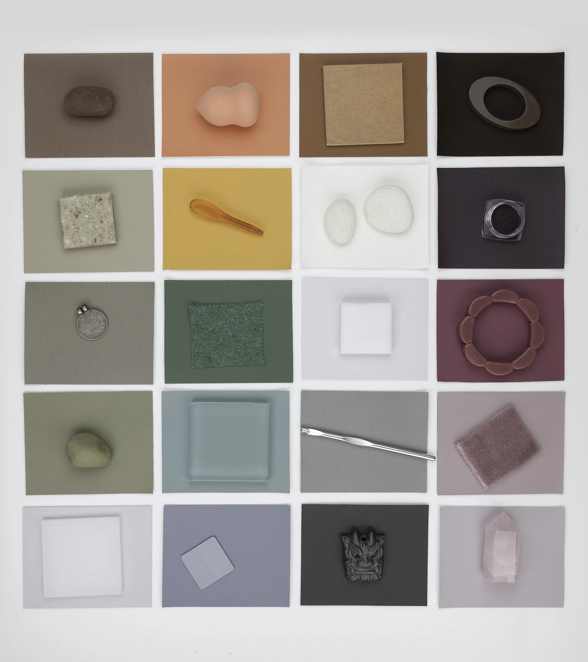
As for inspiration, for me there is nothing that is so new. It is actually a very old inspiration and that is the natural world and nature itself. I realize that when I take time to really stop and look and inquisite about whether it's a stone or a leaf, what is so magical to me is that all those little parts that make the whole, all that gradation of color. The leaf is green, yes, but within it there's so much magic and diversity and range. That is what really motivates me when I put together palettes.
That fascination with gradation is something we've been working on recently with our rug collection, Stria run collection. It's really imbuing and showcasing that beautiful range and weave of color within one, say, indigo. But, within it there's a magnitude of possibility.
Amy: It's like each color has its own personality and if you really show the nuance of that, you get to know the color even better. You get to know its light side, it's dark side, how it looks when it reflects back to you. I think that's a beautiful way of describing your work in color. Kimberle, I want to ask you something about process. At what point do you bring color into the alchemy of your process? Do you start with color? What informs your choices?
Kimberle: Thank you, Amy. Great question. I have many clients, especially Ultrafabrics where they cater to so many different markets, A&D, furniture, transportation, aviation, even fashion. For me, I have to look at all these different moving parts to start the process.
I start out with analytics believe it or not. I look at numbers and it may sound boring, but it really informs me to what is selling in the market. Unfortunately it's neutrals right now, only because I'm a color enthusiast and I love color, so neutrals, oh my gosh. I'm always trying to figure out how do I infuse color.
Then I do a lot of research, especially lately because we're not travelling. Thank you, Farrow & Ball. Your colors are amazing, I'm always inspired. I also need to look globally to trends because my clients have clients in the UK and the colors are different there than they are in the United States.
I have to do a lot of research before I actually dig into what I love. That's when the magic happens. I start to take and put my personal stamp on what I think color is and where it's going and where it is right now.
Before Covid, like all of us, I travelled quite extensively and I always had the heaviest bag. Beads and fabrics from India. Tiles from Brussels. I put everything in my bag and I brought it back, and that became my archive. So, I have a really extensive archive of color and I keep them in boxes because I'm kind of organized. I keep them all by color.
It really does come back to me when I'm doing a presentation for a client, when I'm pulling carpet or wall covering. I take my personal archives and I bring them together and I put them out on a board and I talk about why these things mean something to me, and why these blues or these reds or pinks are important to where we're going.
I think color is transformative, it's intuitive. For me it's thoughtful. I want to be thoughtful about every color I do because it needs to sell at the end of the day. For example I found last November, this beautiful birds nest and woven in it was this really perfectly beautiful mint birthday ribbon. I thought to myself, this is what I'm talking about! (Laughter) Neutrals with color. This bird was very resourceful, although it was a birthday ribbon (laughter) so I don't know.
Anyways, I kept that as something I kept in my studio that I always looked at and reflected on because my job is to... How do you sell color? Neutrals with color. I agree with you, I do go to nature a lot. Nature is the most magical place to find every range of color. I use a lot of color as a focal point and also my color direction.
My process is kind of simple. It's not earth-shattering, but I feel like it really needs to be personal for me to be able to sell it to my clients. Ultrafabrics has been great because they really do understand color. They capture it. They want to celebrate it. That's really my process.
With Covid, again, doing everything online and not travelling has been probably for me the saddest part of not being able to bring things back and continue to keep my archive going.
Amy: I definitely want to see pictures of that archive. It sounds amazing and organized, my favorite. (Laughs) We've mentioned Covid a few times; we are currently in a pandemic. We've talked at the top about how wellness, justice, and communication and connection are really important right now. I'm wondering, how has the pandemic affected your use of color? Are you using color in a more therapeutic way? Are you using color in a more communicative way? Are you seeing trends emerging?
Anna: I definitely feel like, a few people have touched on it, there's this craving. We haven't been able to explore outwards, we haven't been able to do that, but we've been able to look at our surroundings with this renewed gratitude and appreciation and inspiration, even if it's a bit of oily petrol on the road. We can actually find that inspiration anywhere or inside.
Again, at Patternity, a lot of the time we're looking at patterns, but in the broader sense. So, we're thinking about visual patterns, but also what are these patterns inside me, my habits, my behaviors, my thoughts, my feelings, my emotions, and how those play out. And how those also affect everyone in my life, every being, human, non-human who I'm in contact with.
And everything that we're realizing that we have impact. That can be positive, that can be negative. There's been this drive to really explore that and really think that through from a very ancestral perspective and go back and connect with ourselves in stronger ways.
We run workshops where we help people explore marbling. It's very simple, but very psychedelic (laughter). We take people on these experiences where they're really looking at color and looking and seeing how it's interacting and how it's moving and how it looks like it's a river from above, or it looks like it's a vein fractal network.
It's very psychedelic and there's this inner exploration this year that people have gone on and that has involved certain people taking other plant medicines and things like that, to actually really explore. I think that's going to be a trend that is going to come out, is this inner exploration and seeing this with this lens of interconnectedness fundamentally. What might interconnectedness truly, in that we are all completely interconnected and interrelated, how might that shape how we look at something as simple (laughs), but yet completely non-simple.
Like pattern color is this universal language and how can we start to understand it and feel connected to life in ways that we really need to in order to evolve as a species? It's quite big stuff, but it's needed. That we need to speak in these terms now and find that beauty as well, and the wonder in it. Unless we find beauty and wonder, I think that's the gateway that we can start to dig in and ask the questions and really explore. If that's not too cosmic.
Amy: (Laughs) No, I love it. (Laughter) I always think about how music and art help us actually sort of put expression to the intangible and help us process emotions we didn't even really know we needed to process. I believe color has the power to do that, too. When we bring it out of music and out of art and into the real world in real ways.
I think we can do powerful things with color and I think those powerful things can expand our consciousness, can affect the interpersonal dynamics that we have with people, and it can also – I want to talk to you about this Malene – it can also register on the legacy timeline. This moment in time sort of has maybe a color palette to it. Has the pandemic changed your thought process, or are you seeing certain colors emerge for you in terms of how you might respond to what's going on in this particular moment?
Malene: It's interesting, at the beginning of the pandemic when everything was on lockdown, I would go to my studio and I said I have to work with the colors that are in my studio, I wasn't able to order anything. It forced me to have a different relationship with the color palettes that were on hand.
What I did was I forced myself to make sure that I used all the colors that I had and not worry about 'does this go together' 'does this not go together'. I changed my attitude around creating palettes and said all the colors work together. I used all of the colors in everything that I was doing. I didn't limit myself.
I was doing that for a while and I started to create work that I didn't think I would ever create. I wouldn't have created before if I was thinking 'oh I'm only going to work with these two colors or three colors'. I was working with 10, 12. Like I said, anything that was in the studio.
That has continued and it's really shown me that thinking about how I want to dismantle our relationships and the conditionings around how we're taught color should be and not be, really shows that hey, you can have a beautiful object with hundreds, 10, 15, 20 colors. It doesn't really matter and not worrying about whether things go together.
Once we realize that color can be so powerful in numbers as well as in not numbers as well, it could be limited to two, or it could be 20, but it all works. Anyway, to this day I do continue with that and then now I'm in a practice where I am challenging myself to, like Anna mentioned about the indigo and the blues just work with one color, and then work through all the shades. What does that bring up? What kind of work can I create with that type of thinking? It will be just as beautiful as the piece with the 20 colors.
As far as trends and seeing color, I just think that more creatives like myself, artists, are just using a lot more bold and bright color. Not limiting to... For example, if we're doing portraits, I see people being more colorful with their portraits. Not doing it as a realistic to what our skin tones are. Even if there are skin tones, they're not limiting to that tone. They're adding blues and greens and just other color combinations that may not have been expected when thinking about portraiture specifically.
That is also helping to dismantle ideas around people and what people would look like and how we should feel about different communities. If we call them 'trends', those are the type of trends that I'm seeing.
Amy: I love how you expressed that, because it's sort of like a mirror of society. We're all reconciling ourselves with the fact that we are better together. We are stronger when we mix and blend in unique ways and really value our relationship to each other and the diversity and spectrum of humanity that we all get to experience.
At the same time, in the monochromatic scheme of things, it's also really important to dive deeper into understanding people and not ascribe certain relationships to them or look at them and decide that you already know who they are without really taking the time to look at their nuance and get to know them. Malene, it's so beautiful the way you speak about your art, it's really a beautiful poem (laughter) for how we're trying to evolve as a species really (laughs).
Along those lines, how do you see color as an inclusive invitation? If we're talking about color in space, how do you signal that all are welcome to that space? Or how is it a means to imbue a cultural context and identity and a sense of place? I think I'd like to hear what Paddy has to say about this.
Patrick: It's kind of interesting because with inclusivity, I worked on a project two years ago and I literally had to start learning about something called 'light reflective values'. I was working with an organisation in the UK called the Royal National Institute for the Blind and it was really fascinating for me and it made me appreciate, one, how important color is.
But, not just from an aesthetic point of view, from an absolute practical point of view as a guiding point to navigate through a building and to know where boundaries where and where the floor met. Your base boards would be different and where the corners of buildings were and where the lift shafts were and the staircase was.
To give a better an example of light reflective value, an easy example is let's say white is closer to 100 and black is nearer to zero. As long as you've got I think it's like 35 or 40 value points between the colors, people within partial sight or glaucoma and stuff, can actually differentiate between boundaries and limits and wall spaces. It gives that depth of field so you know where you're going, where a corner is. That was really important to me, and obviously really important from a commercial point of view, application of colour within commercial buildings.
The other thing, on another sensitive level is we as a brand have really, and we've never done it consciously, it's kind of suddenly not gender stereotyping about color, about a feminine pink or a masculine blue. It's like, where does that come from? It's a load of nonsense. I had a pink bathroom (laughter) 20 years ago and I was never worried about what people thought about it.
It's just being more accountable. Gender stereotyping of colors is absolutely bonkers, so let's embrace that. We do it. I think we even found something on our color card at one of our browns or blues and it said 'a very masculine shade'. It was like, 'oh no'. It's not laziness, there was no malcontent. It was just literally how we describe color. It's how it was. (Laughter) So, we're just being much more thoughtful in our articulation and backstory. That's really interesting for us.
Amy: That's really fascinating what you just said, and I think that it's interesting to think of ourselves as using color responsibly. We have maybe a power and a responsibility to help 'dismantle' as Malene would say, the relationship of gender norms to color. We also have a responsibility to use color to punctuate physical space so that it's more friendly to people with other abilities. I don't think that we've really embraced or investigated the depths of how much responsibility we have with color
Patrick: Yeah.
Amy: Following on that same question, Larah, how do you see color as an inclusive invitation to imbue cultural context and a sense of place?
Larah: I'd say working again within the built environment, it's very much we need to create the sense of place and inclusion. We design spaces together and bring people together, so how we use color and articulate it and attribute it to a volume of space, whether it's one plane or a whole space, it's so impactful and important.
It actually creates these very nuanced subconscious cues of how work in a social dynamic way, whether we are to gather in rest or there's color and how it's laid on the walls to make you understand way finding through a space. Within architecture and design, color is such an impactful and goes hand in hand with materiality that we have a lot to learn, but I think it's a tool I use and we use on a daily basis to create that inclusion.
Amy: Thank you. We are getting close to the end, so I'm going to wrap up with one final question and I'd love for all of you to weigh in on this. We'll start with Kimberle. Moving forward, what human needs can we meet with color? What palettes, color collections, will be coming out in the next year? What do you think will be the motivation, the underlying motivation for using those color palettes?
Kimberle: First of all, we've taken a large pause in our life, right? One of the things that I'm seeing is that people want experience. They want to be involved. They want haptics. They want softness. They want to make things. I was lucky enough to take the marblizing course with Anna, thank you. But, they want to do shibori, they want to do color, they want to understand natural dye processes.
Moving forward, colors are becoming warmer. Again, a connection to nature, that's really important for what's moving forward. What I've heard from everyone is that this individuality is really important to color and being able to express it in a way. I don't think there are any rules any more. People are really moving forward thinking that they want to be safe, they want to be expressive. People are just more open about color and how they use it.
I think moving forward we're just going to see a lot of really amazing changes, and also some things that are grounded, that are safe, that will keep us together like you said, connected. That's what I see for the future.
Amy: I kind of see our human-made artificial use of color as maybe a means of helping people actually reconnect with nature in a more harmonious way. Thank you for sharing that, Kimberle. Malene, what human needs do you think we can meet with color?
Malene: I think it's going to tie into our mental health. We're really going to see a resurgence of color in multitudes. These palettes that people live in are going to change because we've had this pause, and for those who have been living in beige spaces, they're going to change. Those that have been living in very colorful spaces, they're going to add to it because they see that that's what's making them happy.
We're going to see all these different individual ways of how we live, how we communicate, but it all will end, entail, lead right back to our own personal well-being. That's why we're going to see so many different variations, because we are really tapping into what we need as individuals to be happy, what we need as individuals to bring us joy every day. A lot of us are going to start tapping into our rights to have that joy on a daily basis and not so much as spurts, whether it's on a vacation or these little retreats. It's going to be more encompassed in our daily lives.
Amy: I love that. We do have the right to joy on a daily basis. We do. It does not have to be all drudgery. (Laughter) Larah, what human needs do you think we can meet with color?
Larah: I'd say it's definitely the need of well-being. Moving through this year and a half, we need that resurgence, and healing, and dealing with all that this time has brought to the forefront. I agree, I think there's no rules. No more restraints, let the color be bold, let the color be vivid. Color within itself is a kaleidoscope and now it wants and it welcomes us to just whatever goes, goes. The most important thing is for this positive affirmation to take place.
Amy: Thank you. Anna, what's your take?
Anna: Everyone, we're all kind of coming from a similar place it feels. I think there's certainly we're living through such disconnected times that actually color can bring us back to that harmony feeling. Really it is about feeling. I spoke to my shamanic friend in Columbia last night. I said I'm doing this talk about color and she said every color has a pattern, every pattern has a frequency, and everything is interconnected. When we start to come to that, it's really beautiful.
Connecting more and more with our feelings, with our emotions, and wanting to dive into that and keep diving because we know that we need to navigate through this water and our feelings and our emotions. Coming back to that connectedness is going to be so, so soothing.
An interest is also I'm doing a presentation for Ultra on Wednesday, and I've been looking at how other animals see color. We look through such an anthropocentric human gaze and actually seeing how bees see leaves and flowers and that is ultraviolet, it looks like something from Avatar when you do it. Birds as well, they see in complete different ways. Actually I think that -
Amy: It just opens up a whole new realm to work within, doesn't it?
Anna: Exactly, and to me that's just magic. It takes us again into that acknowledgement that we are one thread within a web of life. That is consciousness, that's awareness, that we are all interconnected in that way. For me, that takes us into something quite exciting and much needed.
Amy: Paddy, close us out.
Patrick: It has kind of all been said, hasn't it, by everybody. It is, it's mental health and well-being and also because a lot of us are being confined for quite long periods of time within our own house and quite a few of us don't have the luxury of lots of space. It's how to work emotionally within the confines of maybe two or three rooms.
We're seeing as a company people, rather than having one color, is using color blocking with delineates space within a house. You go I'm going to paint a rectangle on this wall and I'm going to create a little work station there. Then over here I'm going to do another rectangle at another angle and that's the dining area. It's a nice way to introduce color.
The one thing which is really lovely for me personally, because I love color, I use color all over my house, is we're moving away. Even at neutral territory we're moving, somebody said this earlier, we're moving to warmer and more earth-toned. So, brown earth-based neutrals rather than cooler white and greys.
Also people are embracing much more color. The response to dark colors has been fantastic. Really beautiful, smoky, shadowed forest greens and lovely petroleum inky blues. That's really fantastic for that, because it means we can start exploring color and talking color more because we know.
Any paint brand will tell you this, most people are safe in the territory of off-whites and neutrals (laughter), but because obviously through social media and we share a lot of users generating content on our social platforms, we can show that a lot of people are using color.
Then other people are going 'it's not as frightening as I thought and I was always petrified to commit'. But, because there's so much pictorial evidence of people taking baby steps and then really embracing color, it's kind of a chain reaction which is really lovely to see. Really lovely to see. I'm still waiting for the renaissance of yellow. (Laughter) It hasn't quite happened yet, but I am pushing for that somehow.
Amy: That was wonderful. Thank you so much for the sensual and colorful conversation around chromatic consciousness. I want to thank all the panelists and thank you to Ultrabarics and CLOSEUP for hosting. Thank you so much, everyone.
Thanks for listening! For more information on Ultrafabrics visit ultrafabrics.com. For more information on WantedDesign head to wantedesignnyc.com. To see images and read the show notes click the link in the details of this episode on your podcast app or go to cleverpodcast.com where you can also sign up for our newsletter. Subscribe to Clever on Apple Podcasts, Spotify, Stitcher or wherever you get your podcasts. And if you would do us a favor and rate and review, it really does help people find us. We also love chatting with you on twitter, instagram, and facebook. You can find us at @cleverpodcast and you can find me at @Amydevers. Clever is produced by 2VDE with editing by Rich Stroffolino, production assistance from Ilana Nevins and Anouchka Stephan and music by El Ten Eleven. Clever is part of the Airwave Media podcast network. Visit airwavemedia.com to discover more great shows. They curate the best of them, so you don’t have to. Clever is proudly distributed by Design Milk


Clever is produced by 2VDE Media. Thanks to Rich Stroffolino for editing this episode.
Production assistance from Ilana Nevins and music by El Ten Eleven—hear more on Bandcamp.
Shoutout to Jenny Rask for designing the Clever logo.
Clever is a proud member of the Airwave Media podcast network. Visit airwavemedia.com to discover more great shows.
Keep Listening